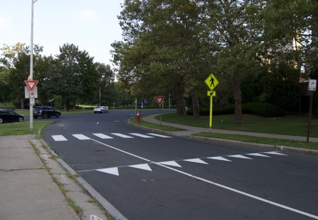
Why have monochrome party banners been painted on the road? Is this to extend #SharkWeek?
They are not yet prevalent in Hartford. They appear with no other instruction. Did the crosswalk painter get bored with rectangles and opt for geometric variety? Will color be added to make the design pop? Am I the only person bothered by the lack of symmetry created by two yield-to-cars signs but only one yield-to-people sign?
These triangles are called shark’s teeth, or yield lines.
The pointy sharks’ teeth seem to say, “Stop here, chum, so the person who is not in a cage can safely cross the street where she is legally entitled.”
Are they useful, or are shark’s teeth to pedestrians what sharrows are to cyclists — that is, the illusion of paint providing any kind of physical protection?
A British psychologist puts it this way: “Where the culture is not aligned with the goal of protecting vulnerable road users then paint cannot be an effective, sustainable solution to safety and more sustainably safe infrastructure would be needed,”
What kind of enforcement will we see? Will that extend to buses and delivery trucks, that frequently idle/park over or right up on crosswalks? Will we see excessively wide roads, such as the one pictured, reduced to an appropriate width that signals to drivers that they are not on a speedway? Let’s not let this be just lipstick on a pig.

Kevin Sullivan
Love these AND the bright stripe on the crosswalk sign post – helps them stick out!